There is nothing quite as daunting as not being able to understand something. In the world of design, there are so many jargon words and tools that are confusing to non-designers. I want to lift the curtain on that obscurity and help you understand some of the basics. So let us begin with the very basic: the logo.
A logo is simply a visual mark that represents a company, organization, individual, or thing. It communicates quickly with an audience and is a point you want customers to remember. Humans are visual creatures and starting off with a memorable logo is essential for any business.
The Complete Package
Using our company logo as an example, the entirety of the graphic is considered the logo. The letters, horizontal line, and fire emblem put together create the overall logo. As each logo can consist of different elements, the definition of the logo is the standard display of all these elements.
Type Only
Within the logo is a part called the wordmark which is only comprised of type. Some logos are only made up of type. The wordmark might be the complete name of the business, an abbreviation of the name, or could be initials only.
The Icon Stands Alone
The icon is a form of shorthand to take the place of including the entirety of a logo. This could be to save visual space, as a display feature, or common place if the brand is well known enough that the full name isn't needed. Think of the Nike swoosh as an example of an icon that works well on its own. If icons are created in the initial design, they are often integrated within the logo to become visually cohesive. Both the wordmark and icon are developed in tandem to produce a aesthetically appealing end product.
This was a quick and dirty definition of what a logo is and what parts it is made of. I believe that the best clients are well informed clients. Being able to communicate what I do as a designer and being understood by my clients makes the process easier on everyone involved.
Happy New Year! And also, Happy Birthday to FireMane Studio! Yes, we're turning nine this January. It's grown from a simple side-job for a solo designer to the full blown company it is today. Nine years doesn't seem that long but as the person who has been running this show for 99.99% of it, it feels a lot longer.
A Huge Present for Us
As it is the company's birthday, we're giving ourselves a very special gift. A brand new website with a clear focus on our mission and target clientele! We look all legit and stuff now. This project has been in the works for the better part of a year but it was the cobbler's children dilemma. Everyone else got new shoes but the cobbler's children. We have been so focused on gaining more exposure, signing on new clients, and completing those projects that we pushed our plans to the back burner. Well not this time! We ran the equivalent of ten marathons in the span of just a few days to design and build the new website.
New Staff in the Ranks
I would like to introduce, and welcome, a lady whom I've known and been working with for over a decade. Josey, title of the happy minion, has come on board as the company's official web developing guru with mad coding skills. Although it's just the two of us running this machine, that's pretty awesome to us! The newest dynamic duo is armed and ready to make great logos and websites.
What's Coming This Year
Now that we're more focused on the services we offer, I personally want to get into more illustration oriented work. It's where I came from as an artist and would like to get back to it. Of course I'll still be making all the graphics I've created the last nine years, I just want to keep growing in the illustration department. Those are projects I thrive with but I find not many people call for it. Even if it isn't work related, you can bet I'll be making a lot of fun pieces just to scratch that illustration itch.
We're also going to be blogging once a week! Josey brings her knowledge and expertise on internet security and what you can do to keep yourself more protected while on the web. I'll be blogging about design tips, tricks, and maybe some how-to's in the future.
We hope you'll join us as we rock out 2017 with our new website, blogs, and check out the new projects we complete along the way. Cheers!
Vacation abound! Well, for many people anyway. It's July 4th and is the last day for a long weekend for many people. Those of us that work for ourselves, this weekend might have been nothing more than a time to play catch up on projects. But where is the fun in that? We are entitled to time off as well.
Vacation Assignment
You're the boss of a company and it's your job to make sure: invoices get sent out, emails get followed up, bills are paid, and vacation time is assigned. That's right; assign vacation time. I only use the term "assign" to emphasis how important it is to give yourself a break every once in a while. You'll have to plan your project schedules around your time off anyway. Why not make vacation another project? The problem with viewing vacation as a break from work means you have to uncouple your thoughts from work mode. Which is the point but it has always been a problem for me, personally. But when I treated time off like another project, I was able to flow out and back into work mode without as much strain on my brain. Time off is just as important as getting work done.
Clocking Back In Mentally
Coming home from a vacation seems to take a long time to adjust to. Getting back into work mode is a struggle as your mind is still on that beach you left just days ago. You're back in the office but you aren't mentally caught up. That's why I treat time off as an assignment. I'm aware of the start date and end date, which keeps my brain in a work flow mode. There's a deadline to be mindful of. You can still enjoy your time away from work, but freelancing demands you to jump back in immediately. Unless you delegate projects to other people, it's on you to pick up where you left off. That can be stressful and might undo all that relaxing in the woods by the lake you just accomplished.
You're Allowed to Relax
No matter where you go on your vacation, enjoy it. No matter how much time off you are able to give yourself, enjoy it. You are allowed to relax and take a day or two to breathe with out emails and projects nagging you. Whether you stay at home or fly to the other side of the globe, take a moment to yourself and relax. You've earned it.
Delivering a message with impact requires two key elements: pictures and design. While the overall design is important to creating a cohesive piece, the quality of the images you use matter just as much as the message you want your customers to receive.
Picture Perfect Impact
Have you ever visited a website where the images were blurry? Or flipped through those coupon magazines and noticed two or more ads using the same image? Or worse, seen a photo that looked like someone took it on their iPhone with terrible lighting? All of these matter to the audience, whether they notice it or not.
Generic is Generic
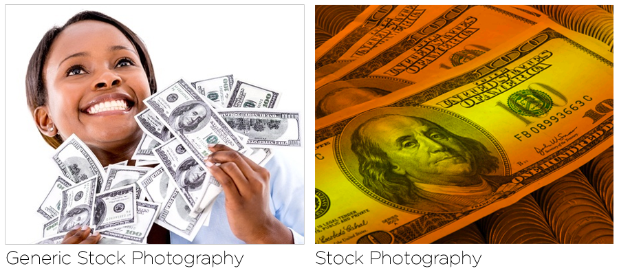
I did a quick Google search for stock photos involving money. While both satisfy the concept of money, the visual impact of these images is wildly different. The generic image has a person holding, obviously fake, bills and smiling on a white background. These kinds of images are plentiful on out-dated brochures and websites. What is she smiling at? Where exactly is she in this sea of white? How can she hold so much money so daintily with her hands like that? As a designer, I ask these questions when I see images like this. It gets the message across
"Money is Good" or "Lots of Money = Happiness." That message is pretty boring and not engaging at all. While the image is crisp and looks like it was taken by a professional photographer, it's just OK.
Now the image on the right also conveys the message about money, but does so with more visual impact. The face of Ben Franklin is in a close-up, making you stare right into his eyes. The bills are in focus while the bed of coins below aren't fully visible, but easily recognized. And the biggest impact; the color. This all looks like real money, but those colors would really stand out against a white background or sheet of paper. It would be impossible to miss. It doesn't state clearly as the image on the left does "Money is Good" because that should be what the copy of the piece does. Images shouldn't be the driving force of your ad, they should be the hook and support to it.
The quality of the image itself is probably more important than the content of the image (but only by a tiny margin).
Quality Makes Impact
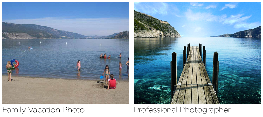
The difference between an amateur photographer and a professional is obvious. I've had clients give me photos from their vacations or images of their resort/home that they insisted on using. While the images had great memories for my clients, they meant nothing to their audience. If your business is a location, like a resort or rentable vacation property, hiring a professional photographer will make a world of difference. Yes, it will be more expensive than using your own photos. But it is more than worth the cost.
The quantity of pictures and images is also an important.
Less is More
The old adage of "Less is More" rings true when you aren't sure if you've added enough elements. Jamming your brochure or website full of stuff starts to get confusing for your audience, even if you think each piece is worth including.
Keep It Simple
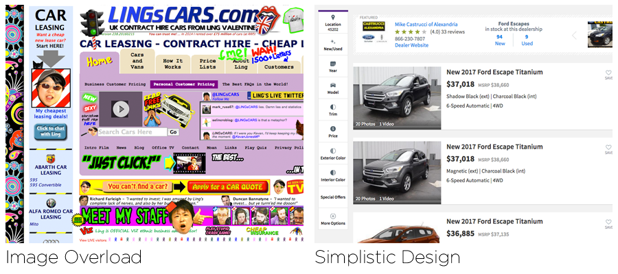
While the site on the left is an extreme example of too much going on, even if the colors were adjusted and toned down, it has too much visual activity to navigate easily (it's also heavily animated). The site on the right keeps it simple with images of just the cars and easy to use navigation. The purpose of both sites; to sell cars. The site on the left sells cars, t-shirts, has games you can play, and who knows what else. The site on the right sells just cars. Clear and simple. If you were in the market for a new used car, which site would you want to browse through seriously? Which one would you spend more time on? And more importantly, which one would you return to?
I use stock images for most of my projects, as I'm not a photographer by trade. I've had minor luck taking my own photos on a cheap digital camera, but I understand the value of hiring a pro when needed. It's worth the money to have great looking pieces and websites that reflect your product or service in the best possible light.
Staying positive in a difficult situation is tough. You know what's going on, you might not have control over any of it, and now you need to fight your emotions and stay up-beat. I've been there and it's tough. Fighting through your own emotions to mask what's really happening is just as hard as dealing with what's going on behind the scenes. But I can tell you this, perfecting the positive attitude can be your saving grace.
Story Time
I recently attended a networking and marketing event. Though I normally dress more professional for these I went in my casual clothes, as 8a.m. was never my favorite time of day to dress up. When I arrived, I was the only one dressed in a t-shirt and capri pants. Everyone else was business casual or in a suit. I've long gotten over feeling weird about walking into a room and feeling like the beginning of Pretty Woman. I found a friend in the group and said hi. She introduced me to a gentleman named Jim, who was dressed very smartly I might add, and we had a lovely conversation. I was happy to talk about my business and how well things have been going this year. He seemed keen to see my work and possibly run into each other at other networking events. We exchanged cards and took our seats for the event.
After the talk, there was another designer chatting to Jim. While she was dressed much better than me, her attitude as pretty bad. Nay, deplorable. She talked at length how terrible things were for her. How she had just gotten into the freelancing world but was woefully unprepared. No online portfolio, no fall back savings, no clients or contacts, just jumped in because she didn't like the company she was working with before. While I can attest to the work situation, I tried to share some of my years of wisdom playing the freelance game. She was closed off to anything I said. She kept holding back tears, or screams, at how she went into a business venture with two other people and how the bank was screwing them over. Jim was visibly uncomfortable, but was stoic and professional. When he asked for her card she didn't have any. Jim gave her one of his and excused himself. Before he left, he gave me a vigorous hand-shake and said it was lovely to meet me.
After Jim left, I tried to get this other designer to say something nice about herself or her work. Aside from being a print designer, she had no excitement. Her situation was obviously tearing her down. I started to feel uncomfortable so I said good luck to her and left.
Be Aware
All I can say is attitude is everything. It's a skill worth devoting time to as it could mean the difference of a good or bad reputation. Cincinnati is a little-big city and the creative field is very much a close community. I've gone to various networking events, hosted by different organizations, and met a lot of the same people. As a freelancer, you must be aware of how you behave. It sounds nerve-wracking (and it is) but it is far more beneficial to stay positive than to be a downer. Leave your personal issues at home and step outside with your professional face on. That doesn't mean you have to be in work/selling mode. Behave as you would in a professional office you're visiting for the first time. People don't want to hear about your sob story. They might sympathize, but they didn't come to an event to feel sad. They won't be interested in it and will be turned off from talking to you at length. You'll also be forever pegged as the one with the sad story or bad attitude.
What do you do then? Ask people more questions. Everyone loves to talk about themselves (admit it, you know you do). You give them the opportunity to lead the conversation and that will reflect well on you. You'll be seen as inquisitive and a good listener. People will take notice and thank you. And if you're still not feeling up for it, fake it.
Fake it till you make it. Cliché yes, but it works. Hence why it's a cliché.
It's difficult sometimes to push myself through a networking event. Somedays I'm not up for it, or I'm stressed, or I'm just feeling anti-social. It's rare that I skip an event if there's any chance I'll make one connection. So when I do go, I don my positive mask and try to keep a good attitude. Trust me, it's worth the effort!
Last Friday night was the Cincinnati ADDY's awards ceremony. I finally had a campaign I could enter for the professional competition and sat with some anticipation when they rattled off the gold and silver winners. Sadly, I did not win anything. Before they announced the Best of Show winner, I was already out the door and back at the bar to get my last free beverage. You might be thinking this is going to be that lamentation of a loser that didn't win anything because her work just sucked or didn't stack up to the big-boys. First off, false on all counts. Second, there's an obvious trend to who wins these awards, and it always comes back to money and hands on deck.
Head Count and Budget
I knew weeks ago that I wasn't going to win, but I wanted to try anyway. It might be some form of masochism that I took the time, effort, and money to enter my work into a contest that I knew I had very little chance in being noticed. I've already covered the subject of judged contests before, yet I wanted to try one more time. After seeing the winners and what projects actually won, I know it's a numbers game.
My business consists of a solitary person doing all the work: me. I design, edit, modify, upload, download, print, proof, and package all the pieces. The campaign I entered was the labor of 11 months and spanned from the web, to social media, to print, to a coloring book, to buttons, to in-person events, and to a hand-sewn puppet. Yes, a puppet. Budget wise I spent more on it than I earned from it. It was for a good cause, a non-profit fundraiser, so I felt good doing it.
The winners had many more people developing the concept and probably even more people involved executing the final product. With much higher budgets and access to skills and labor, my little one person work has no chance on the professional platform against established agencies. Does more money mean 'better' campaigns or just the kind of campaigns that win at peer-judged shows? More often than not, the answer is yes. Is that a solid measure of a successful campaign? Well, that feature was overlooked for this contest. From the impression I got it was just the best looking work, not a reflection of how well it did in the wild.
People's Choice = Judge's Choice
One aspect that I didn't participate in this year was the People's Choice (PC) voting. A total of 16 projects were presented as options for the PC, but there were many, MANY more entries available. Out of the 16 to pick from, two won gold in a different category and six won silver. Half of the entries already won something. That isn't to say they aren't worthy of being in the running for the PC award, but I don't understand how only these 16 were our options.
Being given only a selection of 16 to vote on didn't make sense. How is this the People's Choice if we're told which projects are up for the vote? This isn't the election folks; this is the People's Choice. Why not put numbers on all the projects that were on display and have the people pick from everything? That would actually be a choice. This is a lot like the Oscars where the films that are more often nominated are films that weren't seen by the mass public. It's an inside job by members of the Oscars, not by the box office success of a film. Which is a clear measure of how well, or poorly, received a film was. This is a favorites game played by a select few. This wasn't a reflection of the people at large, just the judges; both the Oscars and the ADDY's.
Looking to Future Awards
This experience isn't one that left me bitter, but has reaffirmed my feelings on judged competitions. If I made work that was only to satisfy a designer's eye, then maybe I'd have a better chance at notoriety among other designers. But I didn't get into this business to be rewarded for making work that only appeals to a specific demographic. I make work that best reflects the brands and businesses I work with. It isn't for me, it's for them. It's always been for them. If they are happy, then I'm happy. And they are not designers. If I make work with designers in mind, I've alienated my client and missed the mark on what really matters.
Maybe one day I'll enter a project that was just for the sake of winning an award. But until they reduce the cost of entry into the competition AND the ceremony, I'll give them a skip.
It hurts when you're replaced by another person at work; it's even worse when your replacement is a machine.
As a freelance/independent designer, other designers and design agencies were my biggest competition. I've only had one or two clients throw out the vague threat of finding someone else at a better (cheaper) price. I currently don't have too much to worry about, as I know what I offer is worth it. But then there are the machines.
I was in denial for so long. I saw the technology coming but I thought it wasn't anything that would actually happen. I shrugged it off and went about my life. But they are here. The machines are here. And they make logos.
Our Robot Overlords Cometh
It was only a matter of time before this became a real issue. In the beginning, there were joke websites where you could generate a parody logo in today's most current design trends. It's very hipster themed and it's essentially for entertainment purposes. It poked fun at how generic everything looked with the use of a simple algorithm and back-end code. The logos were so cute and laughable. Like a puppy barking and growling at you; adorable and harmless.
But then the puppy grew up into a cyborg, using its powers for profit. Now there is an actual business that can create a brand new logo for you and your company within seconds. All for the unrealistically low price of $50. Don't get too excited about this. There are a lot of dangerous things going on here that you might not understand.
While doing additional research, I found there are now a slew of websites that can offer cheap (non-original) logos for under $50 total. So the machine is much larger than I expected, but I'm going to break down how this avenue won't do you, your business, or anyone any good in the long term.
Limited Designs
When you first visit one of these sites, you might be overwhelmed by all the fonts and icons there are to select from. As a designer, I can tell you, most of these fonts are easily found and downloadable for free. The same applies to the logos and icons they offer. I guarantee that 99% of the graphics they display was found elsewhere for free.
Now you might be thinking,
'They have thousands of fonts and icons. The combinations are limitless!'
No, not really. Eventually, logos will be duplicated. Most likely it won't be intentional, but mathematically it WILL happen. Plus if you happen to select a popular font, that will be popular for the next month, your logo won't stand out.
Your business, that you have put so many hours of your life into, thousands of your hard earned dollars into, will slowly fade further into the background. Even if these other businesses don't offer the same product or service, you won't stand out from them. You'll be a copy of a copy. The biggest brand killer of them all.
Pay Little Now, Pay More to Fix It Later
'But I only spent $50 for it. I can just make another one.'
Sure, you could do that. But how many logos will you cycle through within a year? Several years? I've covered the importance of branding before, and as it works for large corporations the rules apply to even the very small. The name of the game is consistency.
If you change your brand too many times it will hurt your bottom line. Customers won't recognize your brand if you keep updating and changing the face of it. Old customers will see you as fickle and unreliable. Businesses are seen as places of stability, regardless of the product or service you offer. Would you trust a car dealership if they kept changing the name on their front door every six months? You would assume it was a new business that moved in.
And even if you only spent a measly $50 for each logo generation, you'll lose more in sales. And the point of a business is to make money in order to keep operating. A vicious cycle, yes, but if you reinvent yourself too much you'll fall behind. If you hire an actual designer, someone who has gone to school and studied for this very process, you would have a logo that has staying power.
People Over Machines
Hiring a human over a machine will cost more. There's no point in lying here.
The work I do, and will continue to do, will cost more than what any cookie-cutter logo-generating robot will produce. Why? Because I take the time to understand your needs as a company. Where you started, where you want to go, all information that these websites don't offer. Selecting your logo like you select a candy bar from the vending machine has just as much lasting power: it's bad for you, it's only a quick fix, and you'll be filled with regret later.
Do better for yourself and your business.
How many follow ups is it proper to attempt before you give up on a potential lead? While everyone is different, my average is three. There are many factors to consider before throwing in the towel if you felt like you tried and got nowhere. Let's start from the very beginning with a basic scenario. You've found a possible new client and have communicated with them on what it is they're looking for or need in regards to what services you provide. They've answered all your questions, you've answered theirs and everything seems to be a good fit. You've completed your first meeting and/or phone call. So what happens next?
The First Follow Up
The first message should be done within 24 hours after the initial meeting. Sending an email to their primary contact address is a must to ensure you stay in their minds. Especially if you're not the only freelancer they are going to meet with. If possible, sending a hand written Thank You card goes much further. This follow up is a lot like after having an interview for a job. It's essentially the same thing.
Your email or card should thank your lead for their time to talk/meet with you and go over the project. Mention you're sincerely interested in seeing it progress into something amazing.
If it sounds like something you're not 100% on board with but still want to work with them and see how it goes, be positive. Don't over share your thoughts on the project if it's something you don't think you'll enjoy working on but want the job anyway. State you enjoyed meeting with them and look forward to working together in the near future. It isn't a lie.
If you aren't feeling like you and the client mesh well, now is the time to bail if you so choose to. Still thank them for their time but let them know that you don't feel this project is something you have the time/capacity to give your full attention. Again, don't over share your honest feelings here.
Always be professional in your correspondences! Even if you're taking a pass, be professional about it. You don't want to burn a bridge before you've built one.
The Waiting Game
With the message sent, now all you can do is wait. After the initial meeting, you'll have a good idea about how your client will behave on responding. How quickly did they reply to emails you sent prior to then? It's a good measure to how quickly they will get back to you. Unless they told you up front that they'll get back to you in a certain span of time, you can only wait now.
The Second Follow Up
If the reply time they stated as come and gone, or it's been at least a week since you last heard from them, it's time for the second follow up.
Send another email stating you're getting in touch with them or following up from the previous message. Remind them of the project you went over together and ask if they're still interested in seeking work from you. This opens the control over to the client. They can really only answer in one or two ways, which shows you're all business. They either do and just forgot to get back to you, or something came up and they won't be using your services at this time. Leaving it open to a vague answer will leave you in the dark, so be as direct as possible here.
Always include your email address and phone number in case the client lost them. It's hard to believe, but emails can get lost.
The Third Follow Up
There can be many reasons why a lead goes silent, even when the meeting went so well. Sending one more follow up might get that answer you're looking for. Normally, if it's been another week from the second follow up is when I send the third. Again, state you're following up with them and the project and posing the question if they're still in the market for your skills.
The trick here is to sound like you're worth hiring. Being confident is tough to pull off, but it's 100% worth it. And you don't know for sure why they haven't gotten back to you yet. It's better to not jump to the conclusion that they found someone else. Leave the prospect open that you're still interested in working with them (if you still are) and tell them you look forward to hearing from them soon. Include your contact info, hit send, and take a breath.
If you still don't hear back from the lead within a week of the third message, it's probably best to move on.
The One that Got Away
There are only so many times you can try to win a client before you come across as desperate. Three seems to be the magical number of trying hard enough without being overly pushy. Sending more than one message a week is a turn off unless the lead asked you to. And if you send one a week and follow up three times, three weeks seems like enough time to know if they're interested or not.
In the end, you can only do so much as a freelancer. Pushing too hard is dangerous to not only to that potential client, but your reputation. If you're labeled as pushy or overbearing, you might not get many more clients in the future. Sometimes, there isn't anything you can do but accept it won't happen and move on. Hope isn't something you can live on if you work for yourself.
It's the Monday after Super Bowl 50 and the Broncos are still basking in the afterglow of their win over the Panthers. I'm personally not a huge fan of (American) football. Sports in general were never something I was terribly interested in. But the last decade or so, the Super Bowl has been more and more about the commercials than just a sporting event.
A whole new flock of fans that watch the game just for the ads has morphed the platform of sports entertainment during the biggest game in the U.S. A 30 second commercial costs several million dollars as it has a guarantee of millions of eyes watching it. Even the half-time show pales in comparison to many ads that last less than a minute. When the prices got high, companies could only afford one time slot. This year, there were fewer varieties of brands and many doubled up with more than one ad. And from the roster that could pay-to-play during the game, they were overall underwhelming for me. That's not to say there wasn't some funny or poignant ones, there was just less than previous years.
Personal Favorites from Super Bowl 50
Doritos- Ultrasound
Who doesn't love Doritos that has had them before? A set of parents getting an ultrasound near the end of a pregnancy is a done-before premise, but they had a twist. The father, who, of course, is sloven-looking and eating from a large bag. The wife/mother states her annoyance. The fetus responds to the chips the father is holding and dad fakes-out the fetus before mom gets more annoyed and throws the chip. Then the fetus shots out of her to pursue the chip. Simple, yet effective. What I wasn't a fan of was the colors of the room. Pale, slightly green, pretty gross, even for a hospital setting.

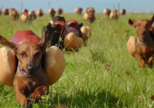
Heinz- Meet the Ketchups
A flock of dachshunds wearing hot-dog costumes run towards a line of people in different Heinz product costumes. Simple, straightforward, bright, and upbeat. I have a dachshund and she does have two hot-dog costumes. It's part of the agreement to owning the breed, read the contract. So I might be bias on this one. But who doesn't love a flock of dogs running and leaping/jumping/being tossed by a crew assistant into the open arms of people?
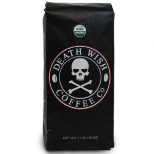
Death Wish Coffee
A strongly caffeinated coffee ad played during a game that is 99.99% about cheap American beer? Sold! Vikings row in a dark storm, proclaiming death is a great thing, before being literally swallowed by a bearded man. Plus the epic background music is by Two Steps from Hell. If you haven't heard of them, you need to add them to your work-out music playlist. Running on a treadmill never felt so epic. Just so many things I'm down with rolled into one.
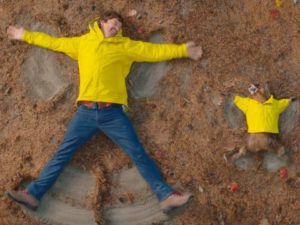
Marmot- Fall in Love with the Outside
Animals were a big theme this year. Here's an ad with a marmot hanging out with some guy in the woods, hiking, eating s'mores, and watching the sunset on a cliffside. The guy goes in for a kiss and gets smacked by the marmot, stating he (she?) isn't that kind of marmot. He was shut-down by a clothing wearing rodent. Ouch. I've never heard of this brand before. When I buy outdoor gear, I hit thrift stores first as brand name outdoor clothing is astronomically expensive. But this ad was cute and I might check out their items online. Maybe they're less expensive. Either way, I remember their name.
Nightmare Fuel for the Month
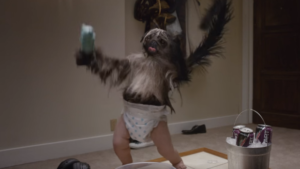
Mt. Dew Jumpstart- Puppy Monkey Baby
What the absolute hell? I've had this drink before, and it isn't bad. It's also not something I would willingly buy in bulk either. But the combination of "three awesome things" failed here. Their hybrid was an abomination to nature and was more the stuff of nightmares than a promotional mascot. Memorable, yes. But at what cost?
Final Thoughts
For me, these were the only ads that stood out while I was watching/pretending to watch the football game. In a house filled with people, these were the only few that everyone got quiet for so we could all hear them. Super Bowl time is meant to push people to their limits, to see just how far they can go. Players and advertisers alike. This year was underwhelming for both the game and the ads. Only a few ads are worth revisiting, but the rest were as beige and bland as a four door family sedan. When you must spend several million dollars for a single ad spot during the game, we, as consumers, expect to be wowed by what you spent all that money on.
Robots. You either love them or fear them as one day they will overtake the human race Terminator style. I have mixed feelings about robots. They can do things humans cannot but I've got one foot in the paranoid camp for when they become self aware. For now, let's show these cold circuit-boards some much needed love.
Having a website where people can comment on pages, it's just a matter of time before a bot comes to fill my site with spam messages. It's painfully obvious they weren't written by a person, but some of the comments I admit are hilarious! From terrible grammar, to outdated references, to the complete bot form generated to make thousands of comment variations. Each special in its own repetitive way.
I'd like to share some of the best ones I've received just this morning. No idea why they all came at once like this, but it cheered me up while having my morning coffee. If nothing else, they are all very supportive of my blog|website. Almost like a digital cheerleading squad, just for me.
Enjoy the beautiful fail!
"Ahaa, its good discussion about this article here at this website, I have read all that, so at this time me also commenting here."
Good to know.
"Hello! Someone in my Myspace group shared this website with us so I came to look it over."
Total Gen X bot here.
"Shame on Google for not ranking this higher!"
I really wish this one was trying harder to get me a higher ranking.
"You sound very much like expert on this topic you talk of."
You flatter me.
"Fantastic! I was not sure I should follow you but you have convinced me with this blog!"
Just like running for office.
"Simply want to say your article is as amazing."
Thanks?
"Well with your permission allow me to grab your feed to keep updated with forthcoming post."
So polite to ask first.
And finally... some excerpts from a form used by a bot. It must have had some bad code to paste all the comment options. Maybe robots like MadLibs too? The entire post was ten scrolls long, so here are some of the gems.
"I {couldn’t|could not} {resist|refrain from} commenting."
"{Please|Kindly} {allow|permit|let} me {realize|recognize|understand|recognize|know} {so that|in order that} I {may just|may|could} subscribe."
"I {want to|wish to|desire to} read {more|even more} things about it!"
"{It’s|It is} {lovely|pretty|beautiful} {worth|value|price} {enough|sufficient} for me."
"I am sure this {article|post|piece of writing|paragraph} has touched all the internet {users|people|viewers|visitors}, its really really {nice|pleasant|good|fastidious} {article|post|piece of writing|paragraph} on building up new {blog|weblog|webpage|website|web site}."
"Keep up the {superb|terrific|very good|great|good|awesome|fantastic|excellent|amazing|wonderful} works guys I’ve {incorporated||added|included} you guys to {|my|our||my personal|my own} blogroll."